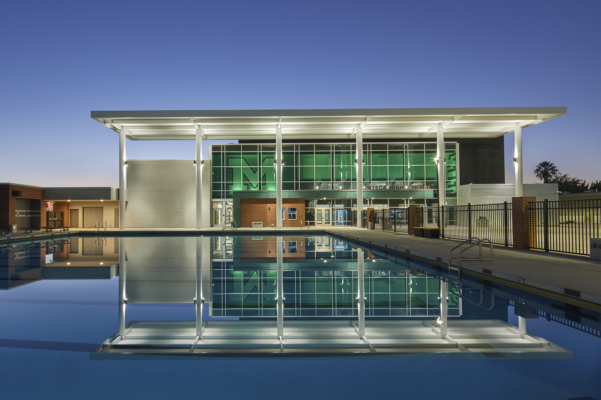
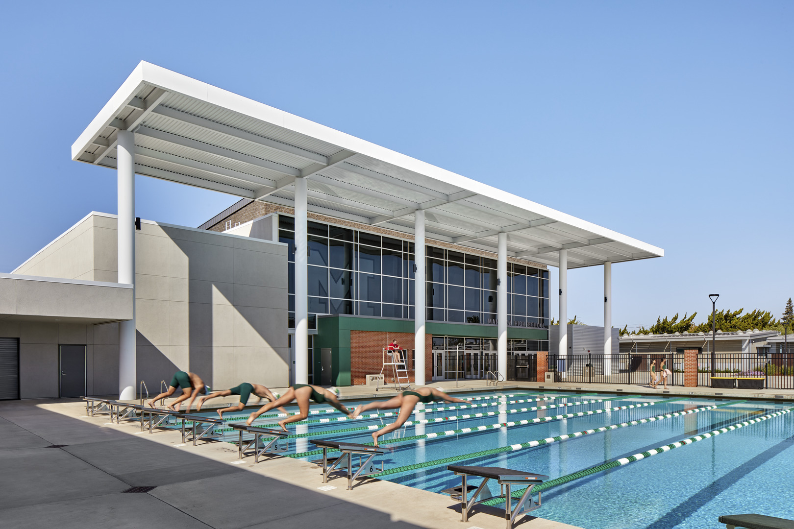
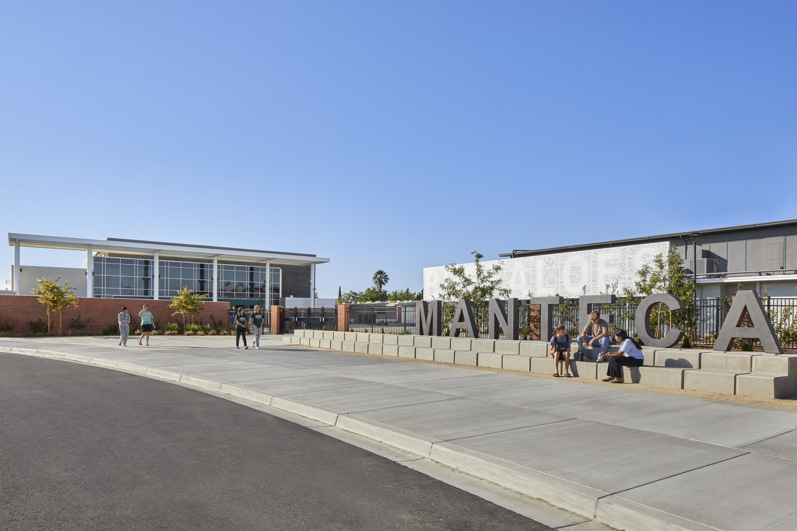
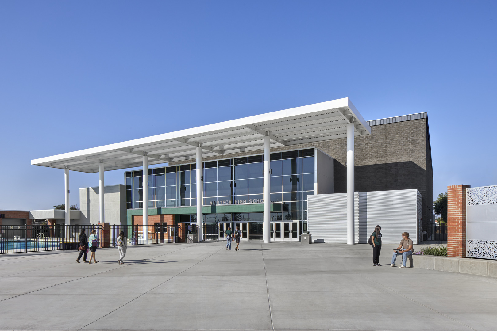
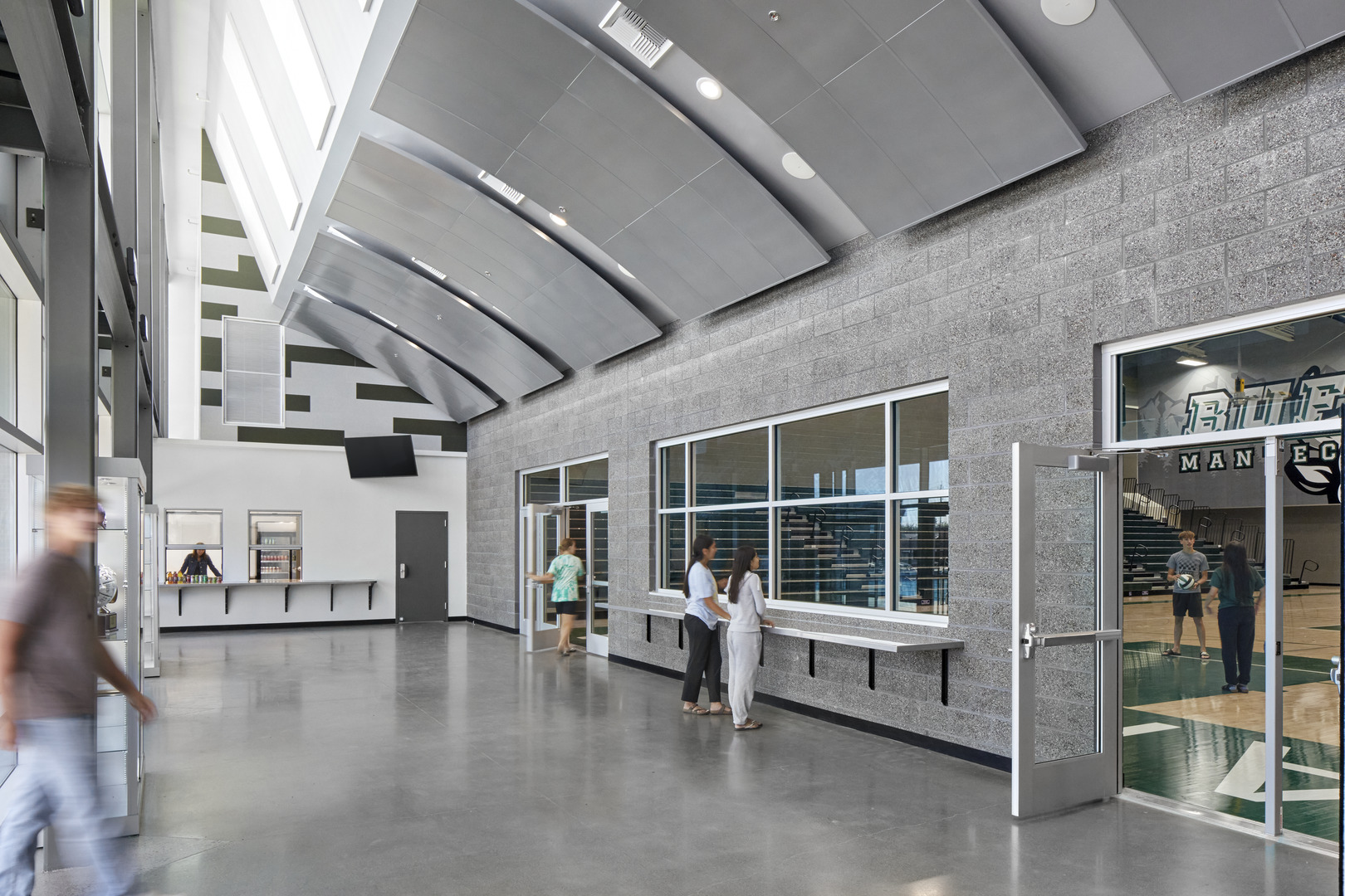
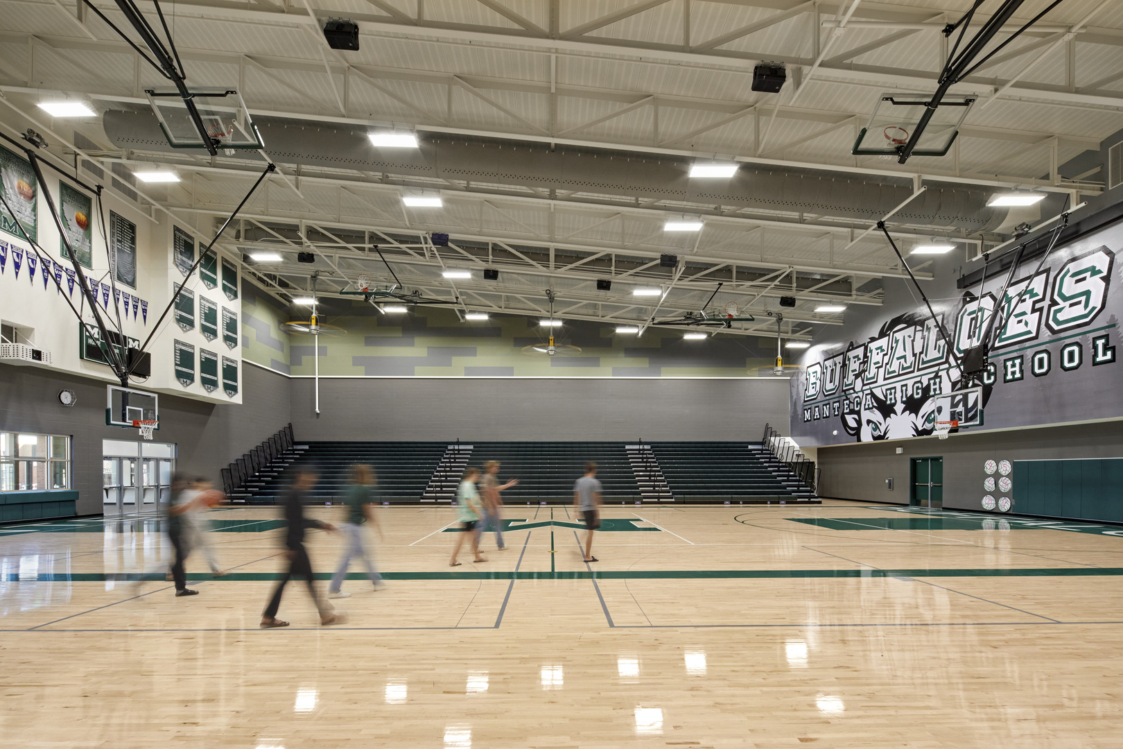
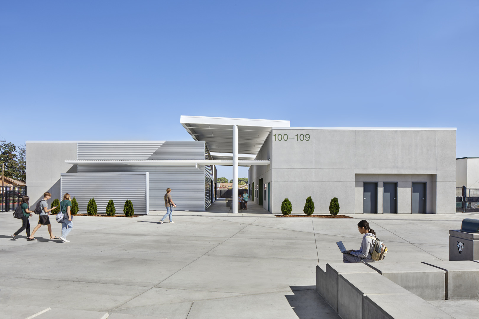
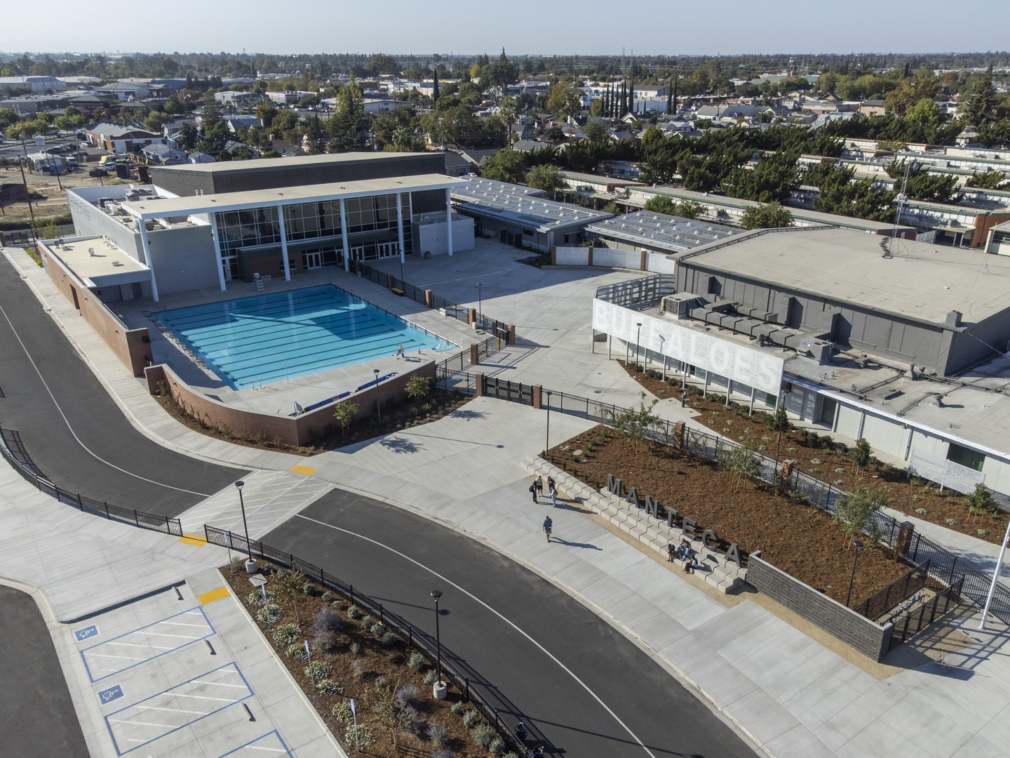
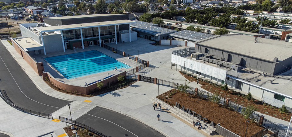
This project was the third increment of a plan to reconfigure the south end of the Manteca HS campus. Though the reconfiguration took many forms during design and included much-needed facilities upgrades, the main goal was always to unite the two halves of campus, once divided by a public road, in the interest of student safety and supervision. We closed off the road and designed a quad to unite the two halves of the campus. This made the campus safer with more usable space for students. We opened the area between the gym and classrooms to create a new student drop off and entry area. With 10 new classrooms and room for 350 students, the new classroom building added capacity to the campus and is a shining example of a flexible teaching environment, a critical component of MUSD’s educational specifications. The new gym and pool replaced an aging, smaller facility to give the campus a more collegiate feel. The gym, with room for 1600 spectators, lets fans feel part of the action and allows the district to host tournaments and meets on the campus.
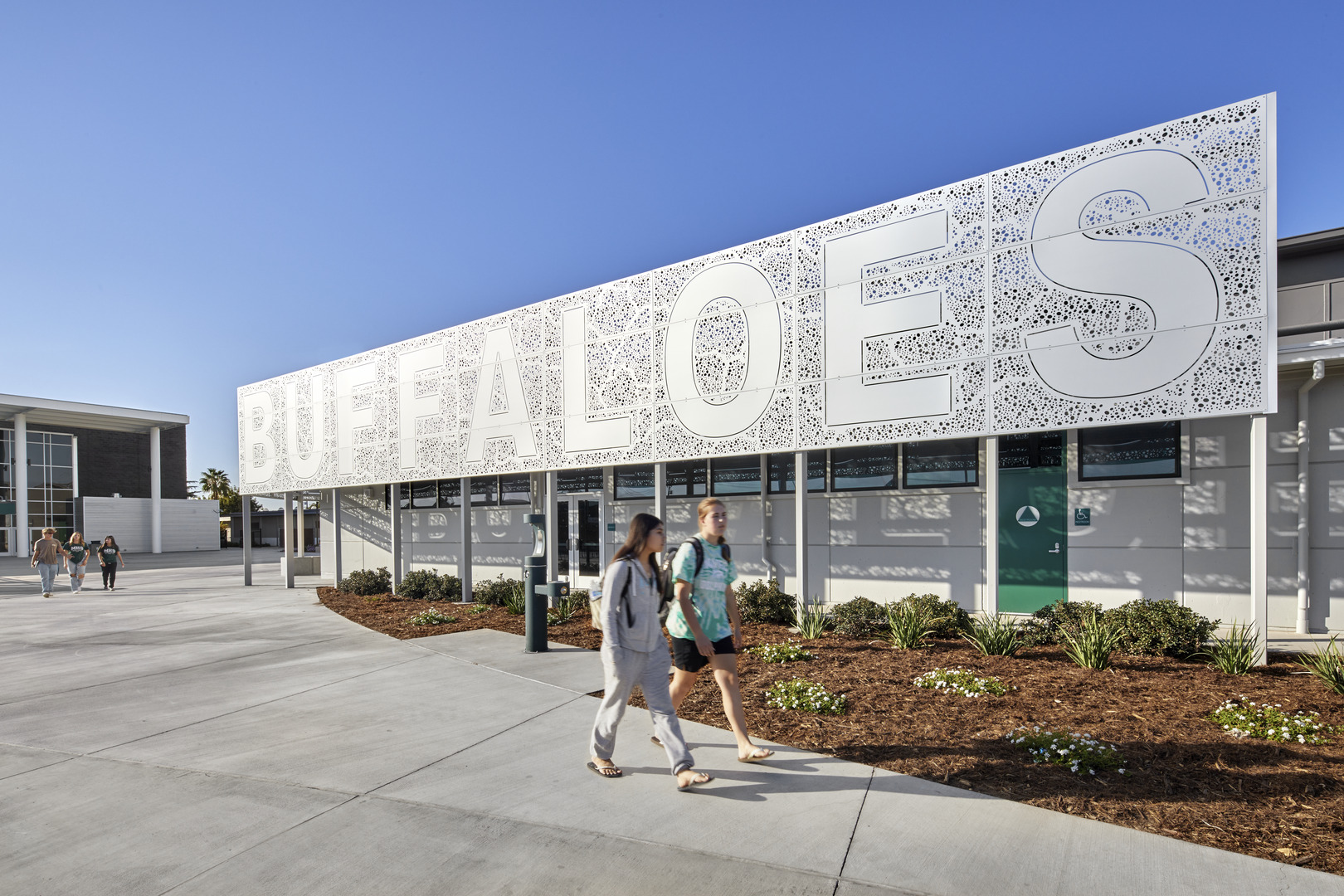
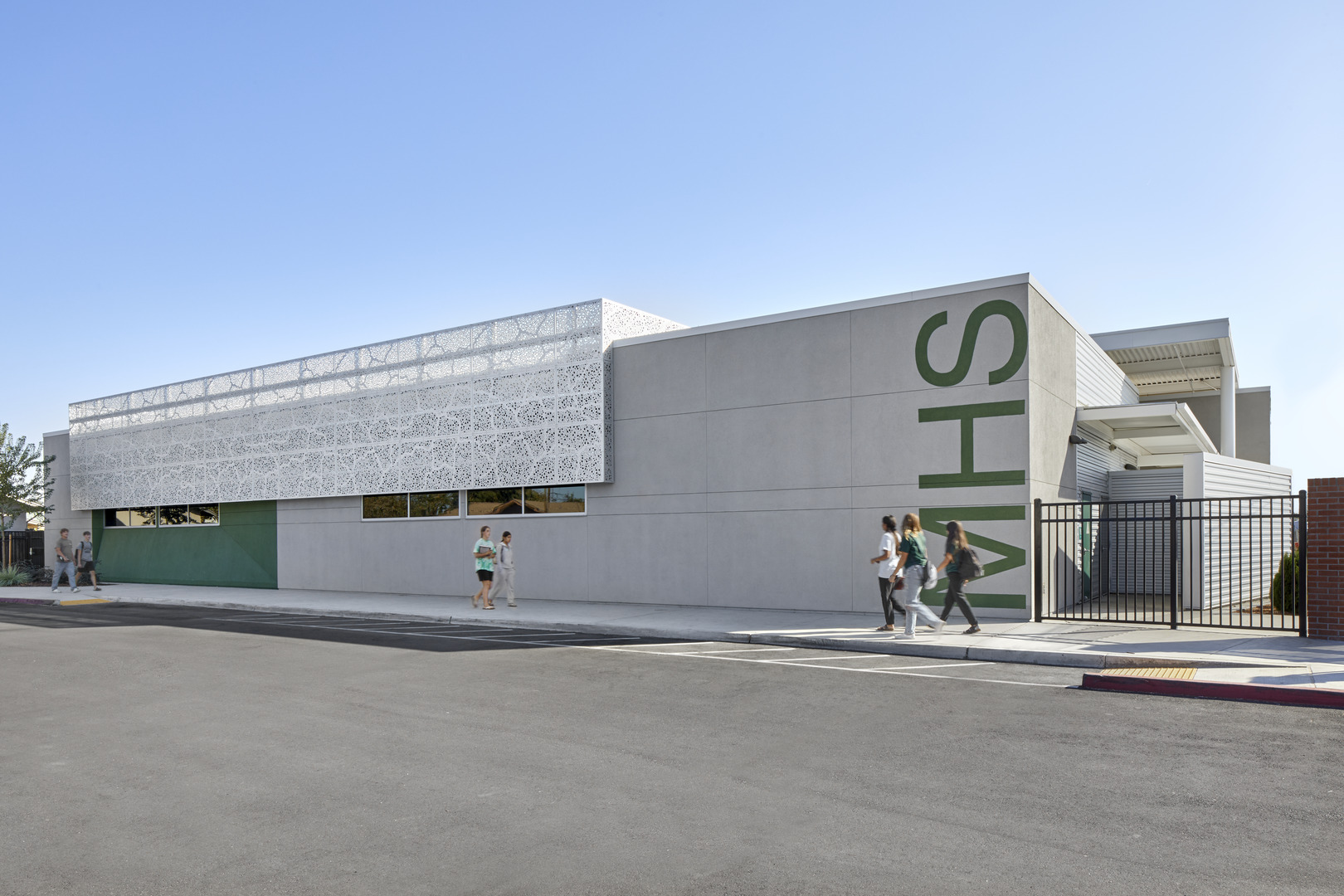
Taking inspiration from the existing campus materiality, the design team chose materials that tied into the existing conditions without replicating them. Dark grey CMU blocks with a high concentration of exposed red/orange aggregate visually link to the existing brick of the surrounding buildings. Not wanting to fully exclude brick in our design, we used it within site elements such as the pool wall and fencing. A Basalite concrete color palette gives textural interest and a high level of finish. The material is perceived differently at different distances— from far away it appears one dimensional, but at closer distances you see the texture, and the multitude of aggregate colors. The district wanted to add a defining feature to the buildings to update the campus identity, foster campus pride, and be applied to future campus projects. Our solution was a series of custom perforated metal screens on and around the classroom building and the gym, which not only serve the campus aesthetically but also shade and screen the building, hiding rooftop HVAC units and back-of-house operations. While the panels on the classroom building are perforated, the screens elsewhere on site were used as a branding opportunity, proudly displaying “Home of the Buffaloes” on over 115 feet of the metal panel. The same panel language was used within the gym in a sports storage area. This feature will continue in the next phase of the campus, taking it to new heights on two, two-story classroom buildings.
The Buffalo community could not be happier with the results of Phase One of the modernization on campus. The classrooms are not only aesthetically gorgeous, but they are functionally outstanding. The white board walls, the moveable desks and the tech set-up make teaching and learning more streamlined and effective. The gym gives the MHS campus a collegiate feel that we look forward to seeing throughout Phase Two and Three. The comments from our community have been incredibly positive, and we are excited to see what is coming in the future to Manteca High. – The Manteca High Administrative Team
