
This week’s Pick of the Week comes from Interior Designer Sepi Salehirad, CID, out of our LA studio. Read on to discover Sepi’s current craves and faves, and how she’s using colored grout to add a splash of color to almost any space.
Shaw ‘On the Edge’ Carpet Tile
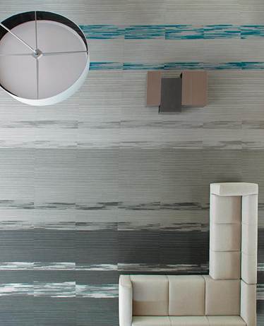
This new carpet collection from Shaw provides unique options to individualize design like never before. The 18×36 tiles offers much flexibility and the random edge patterning creates dynamic effects that give a painterly effect. I’m excited to play around with the many options and can definitely see this being used on a variety of HMC projects! For installation ideas, check out Shaw’s website at http://www.shawcontractgroup.com/ProductSpec/Show/59164/64515
Superordinate Antler Chandeliers by Jason Miller

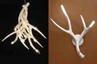
Designed by Jason Miller — I love that these light fixtures offer a rustic meets contemporary design. When lit, the lights throw shadows of branch-like ceramic antlers onto the walls and surrounding ceiling area. Jason’s designs often draw on everyday aspects of American culture to create contemporary design objects that could just as easily be conceptual art.
Maharam Digital Projects


These large-scale, digitally printed wall installations are created by emerging as well as established artists for Maharam textiles. The prints can be scaled or repeated and are produced on a project specific basis to be used as an alternative to art or costly wall finishes. I can see this being great on an accent wall in a large public space. To see all of the digital projects, go to http://www.maharam.com/vl.html and click the binder on the far left.
Colored Grout
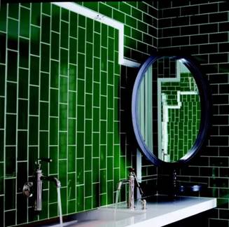
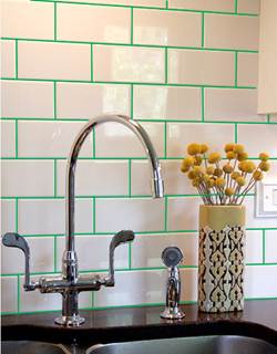
Jim, our interior architecture principal in our studio, asked our interiors team to each come up with a design obsession that we can implement in new projects and this is mine! I love the idea of using an ordinary and often overlooked finish such as grout in an unexpected way, to bring an interesting, graphic element to a space. We used this idea on a current high school project to bring a pop of color to a standard school bathroom. Inspired by this image on the left, I inverted it for my own design concept shown on the right!
