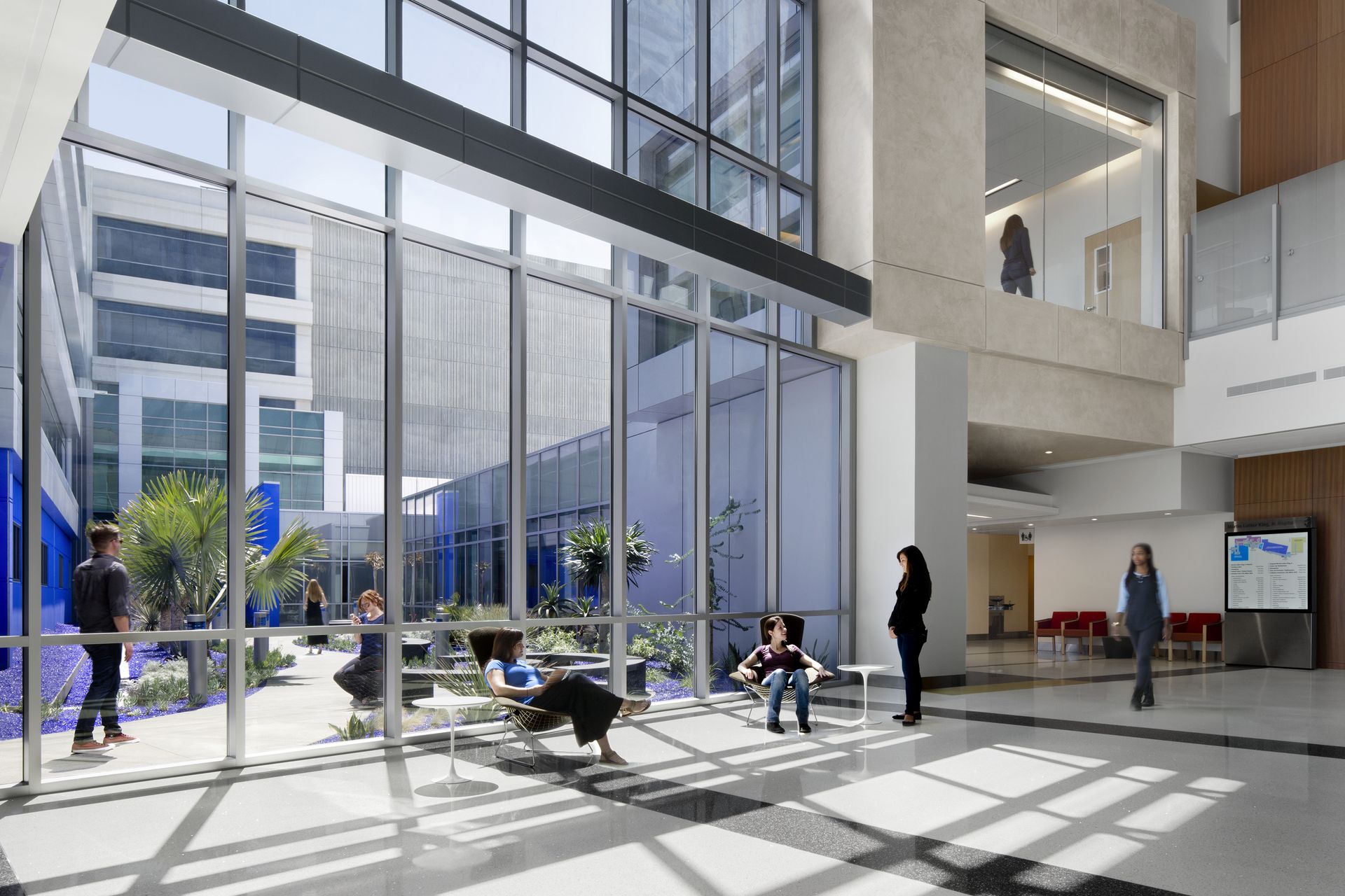
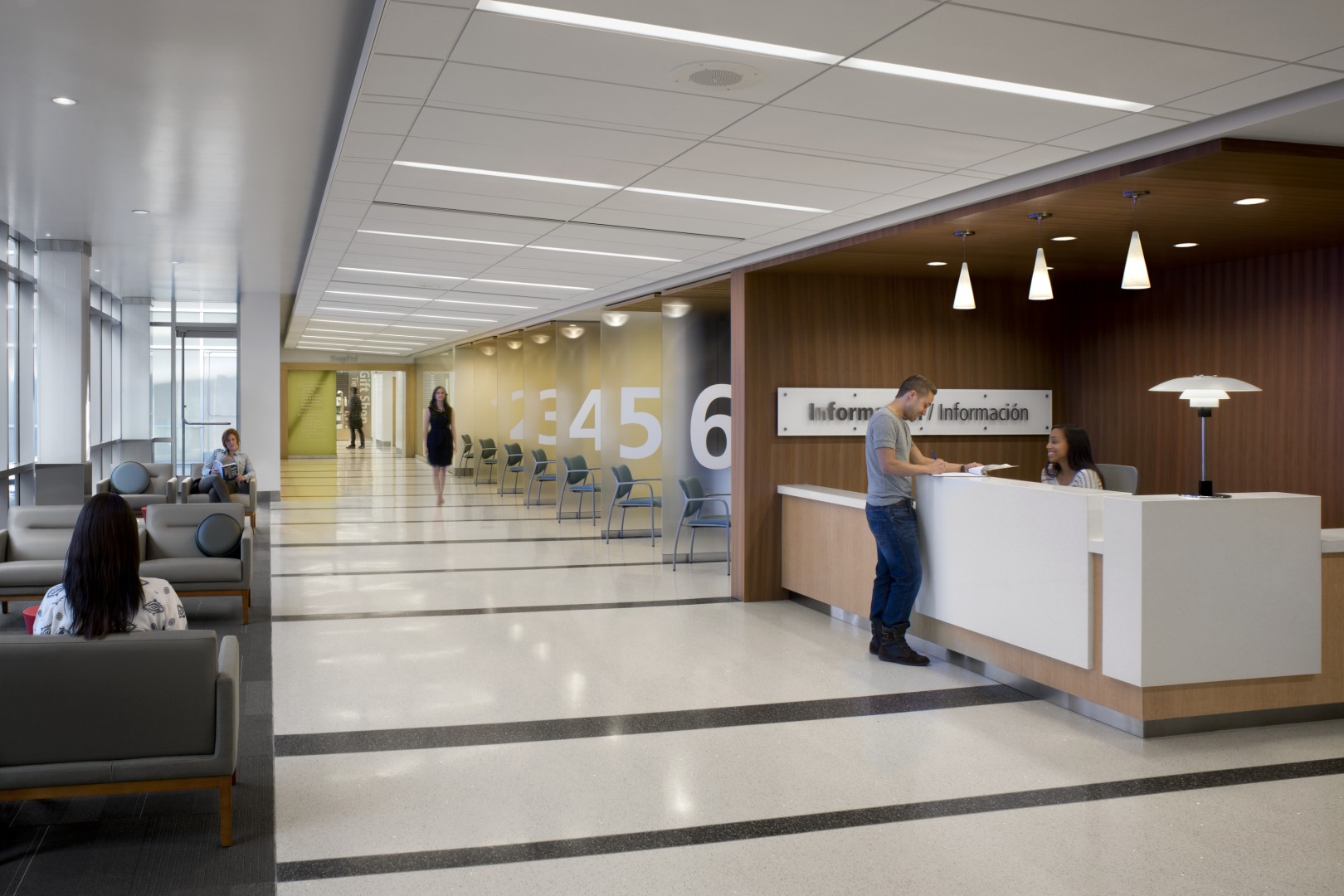
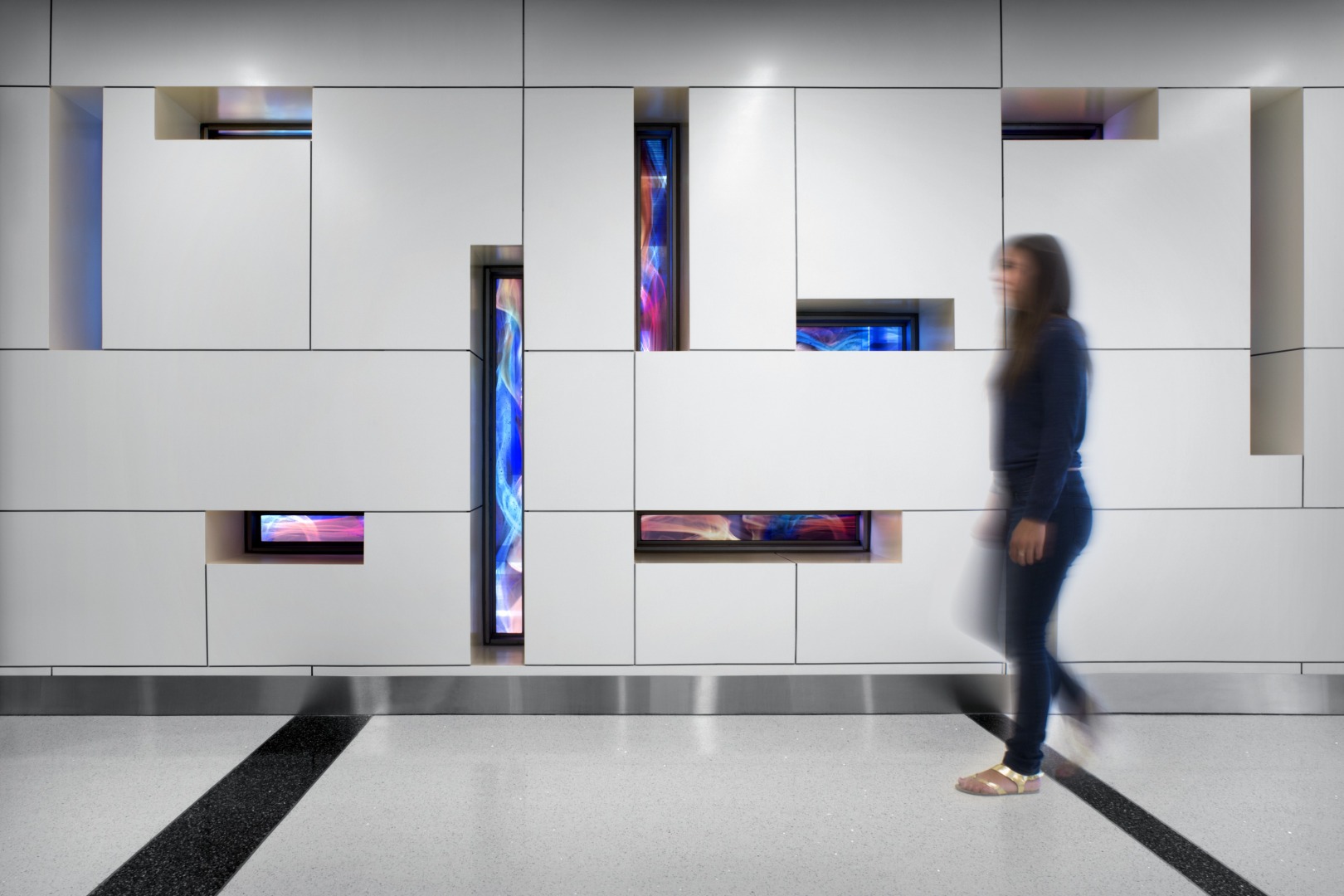
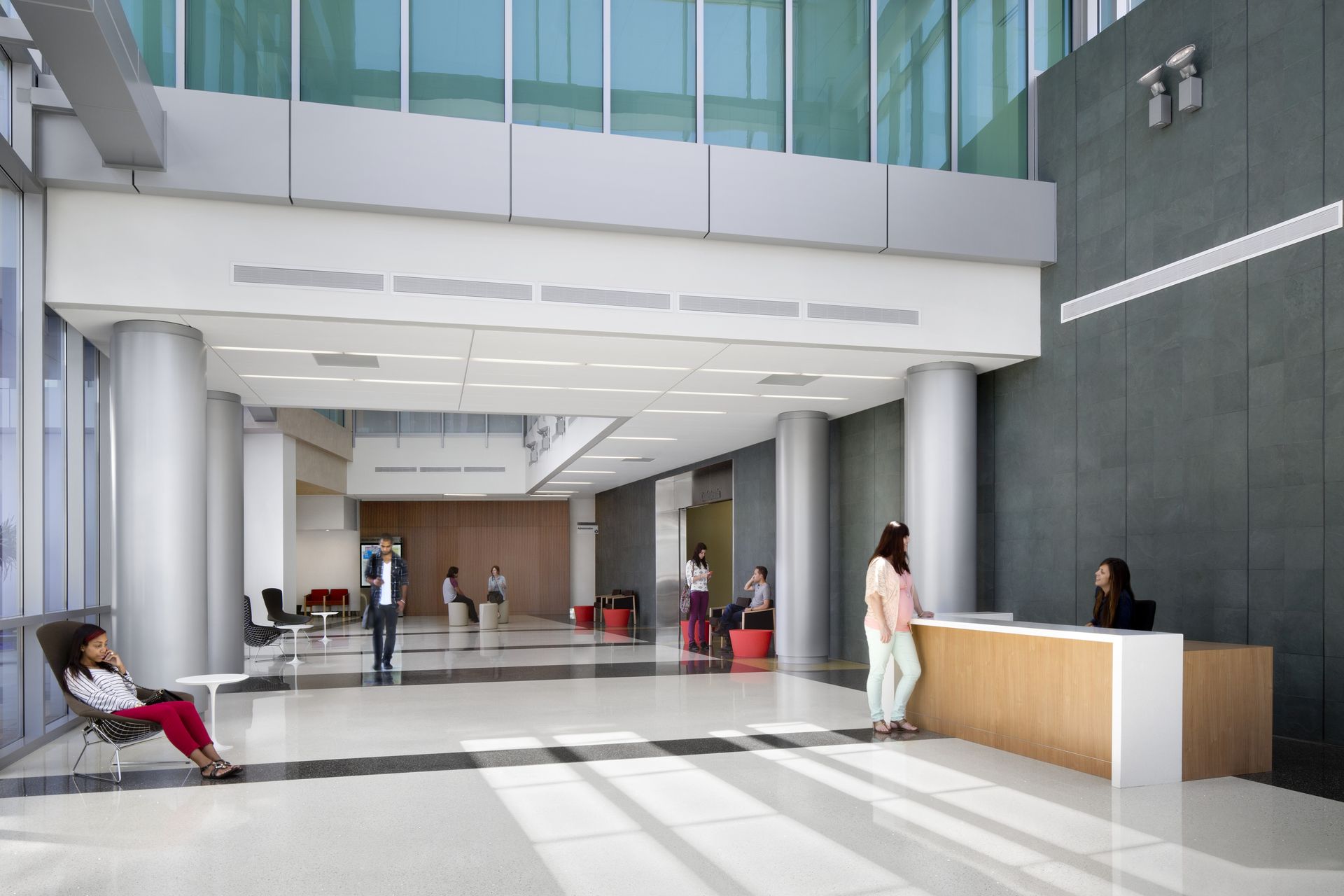
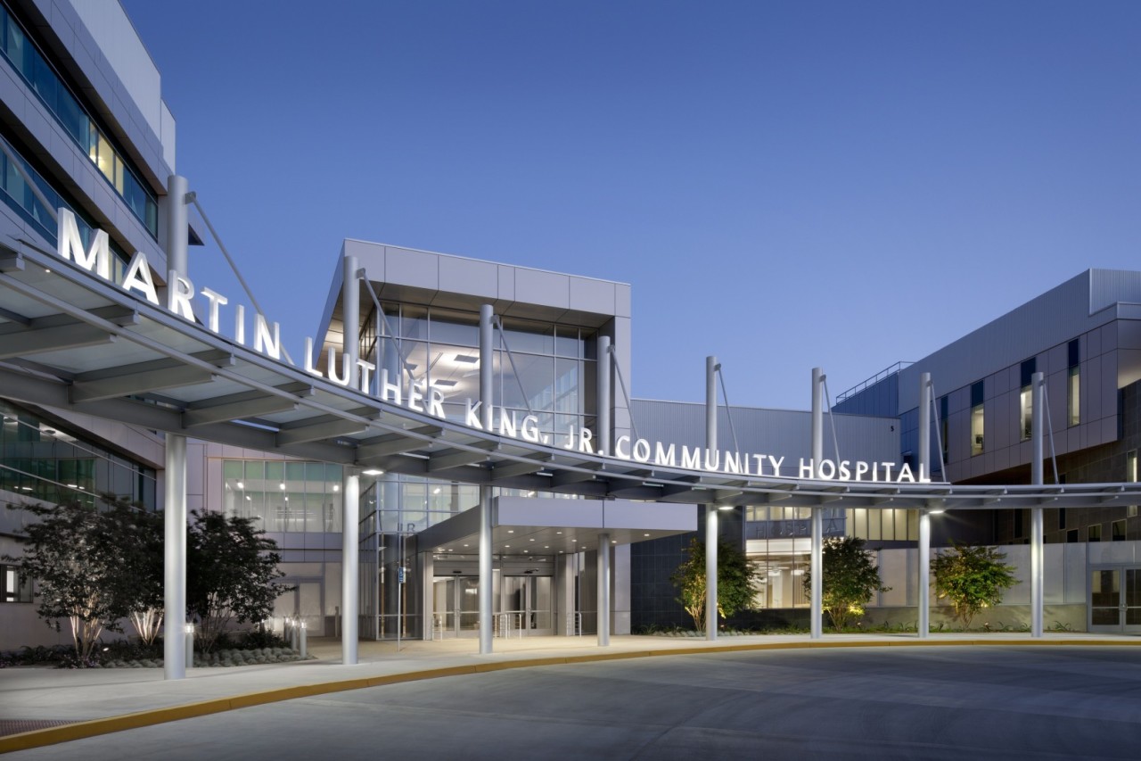
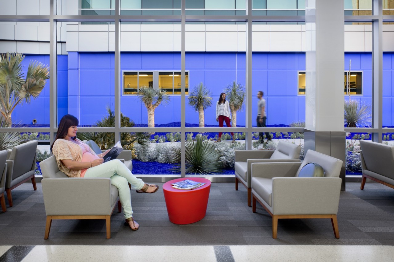
Since economically challenged communities often receive poor design, our design solutions prove that aesthetically pleasing, effective design doesn’t have to cost a fortune. We used smart design to expedite and improve patient care by reorganizing the flow of the emergency department—creating a designated fast track area for low acuity cases and separate, more comfortable bays for higher acuity cases. We introduced a warm color palette and special finish materials including terrazzo floors, marble and granite, and solid surface plastics to make the hospital feel more welcoming and less institutional. To improve patient healing and recovery, and staff performance and morale, we incorporated natural daylight and cityscape views. The new entrance is the focal point of the building’s façade and is comprised of new metal panels and blue-green glass, renovated precast concrete with tinted glass, and a new ribbon-like steel and glass canopy. What stands is a beautiful, efficient hospital that would be as at home in Beverly Hills as in South Los Angeles.
-
-
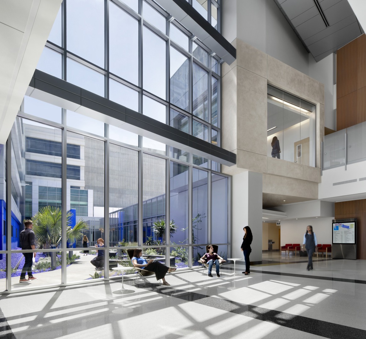
Photo by David Wakely
-

Photo by David Wakely
-
-

Photo by David Wakely
-
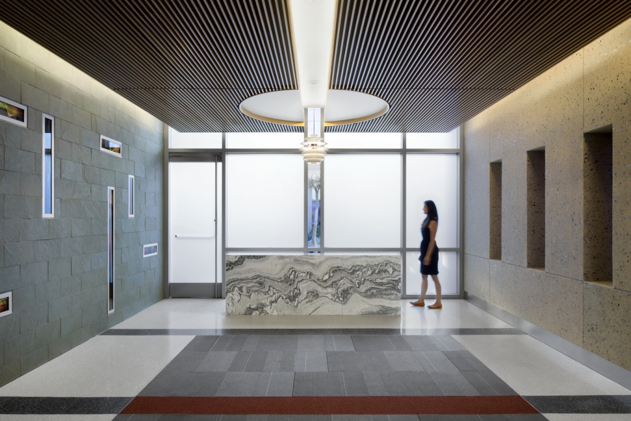
Photo by David Wakely
-
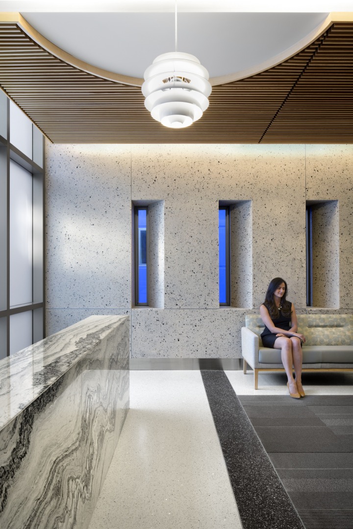
Photo by David Wakely
-
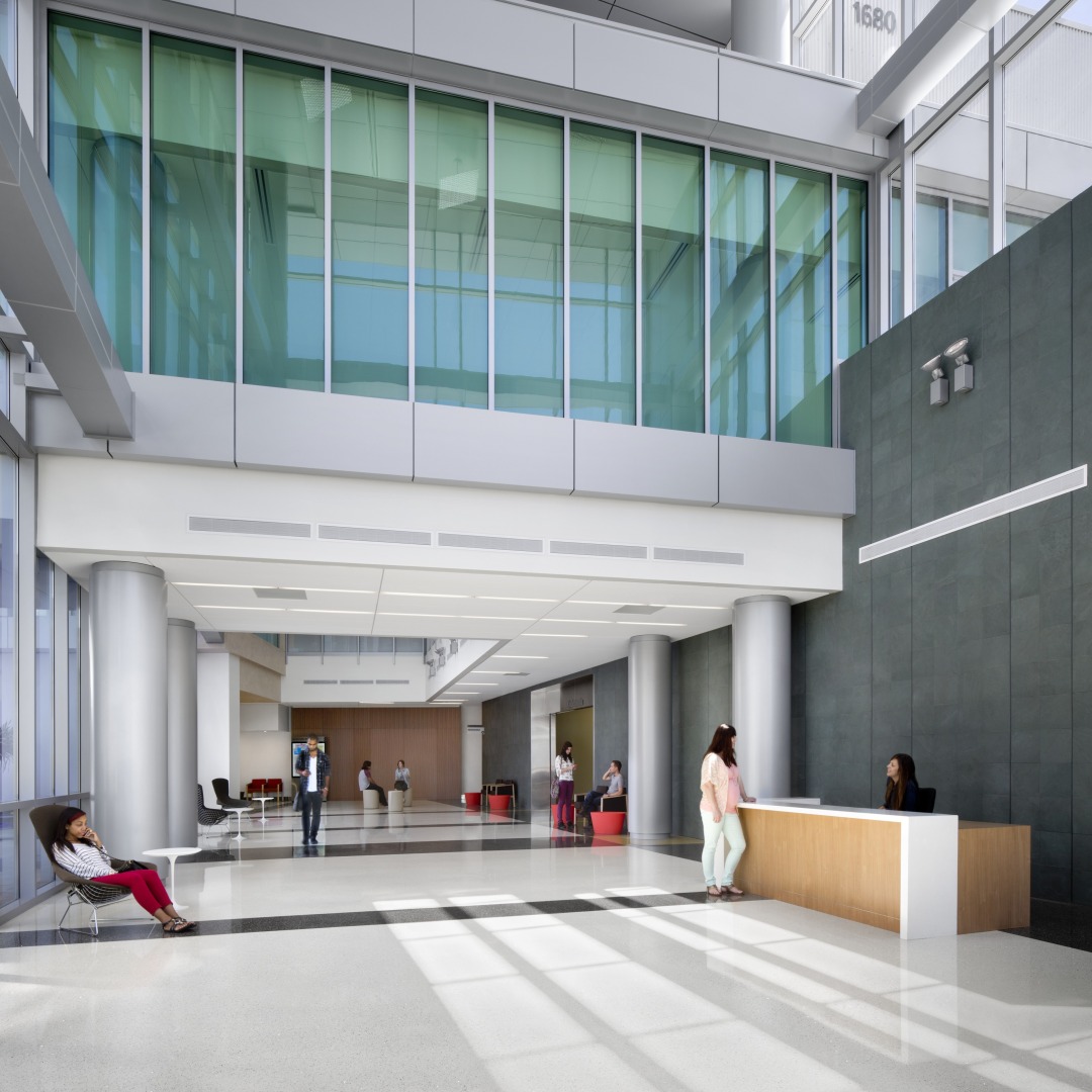
Photo by David Wakely

