The school’s housing staff was concerned about increasing the number of residents per floor from 54 in Phase III back in 2011 to the proposed 120 residents per floor in the current Phase IV project. To adapt to the increase of students per floor, the HMC Architects + Sundt design-build team focused on two interrelated strategies to align their goals with the budget and student success: identity and access.
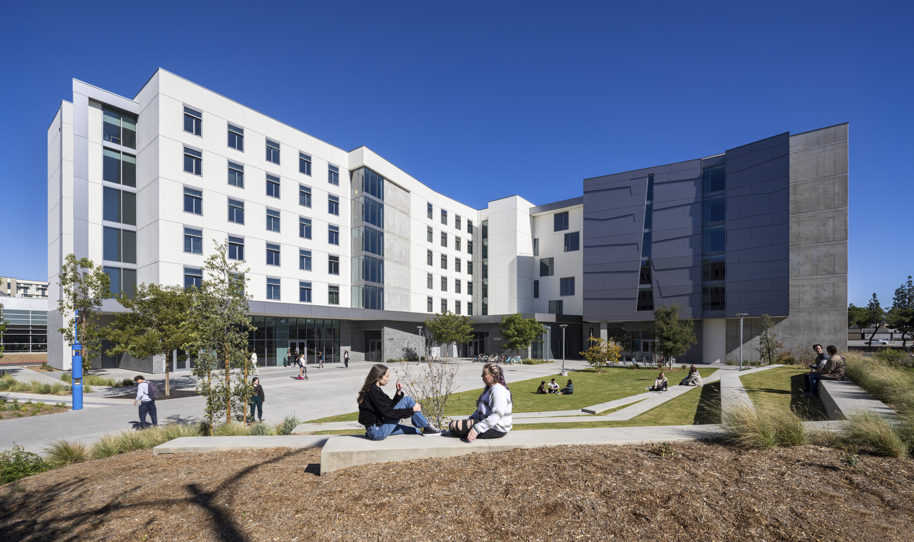
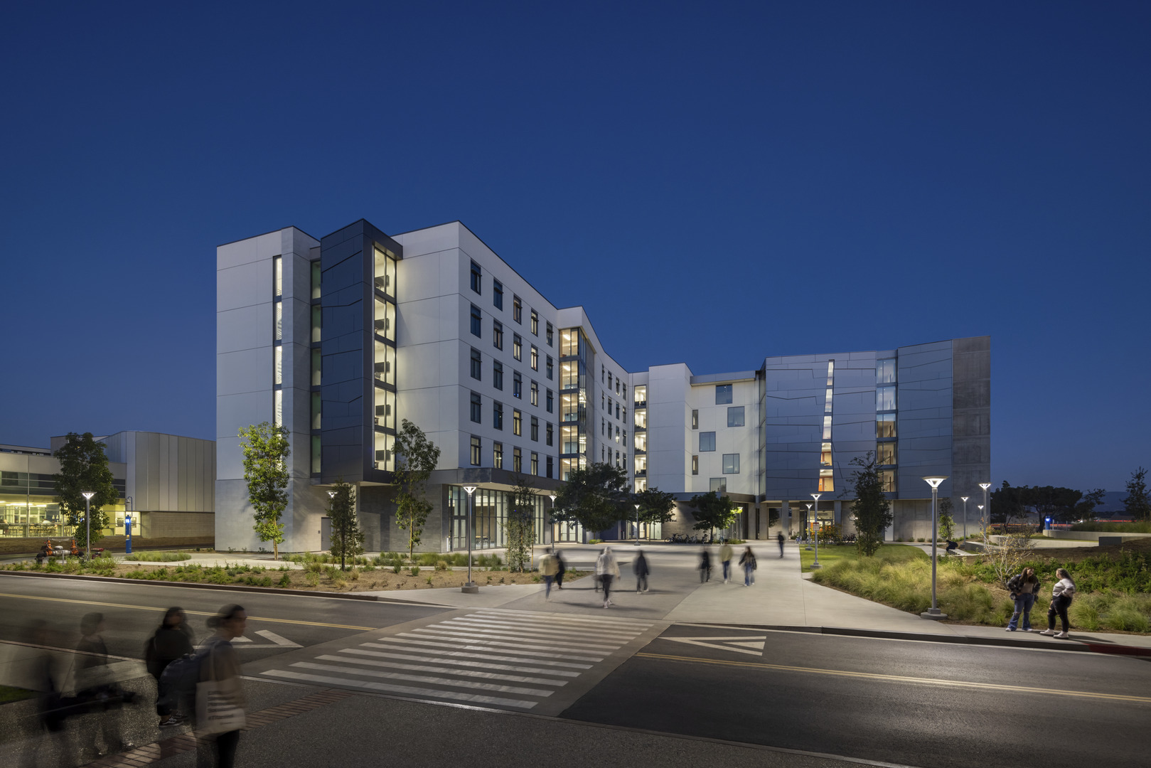
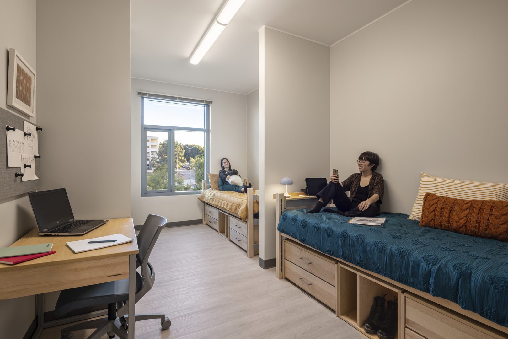
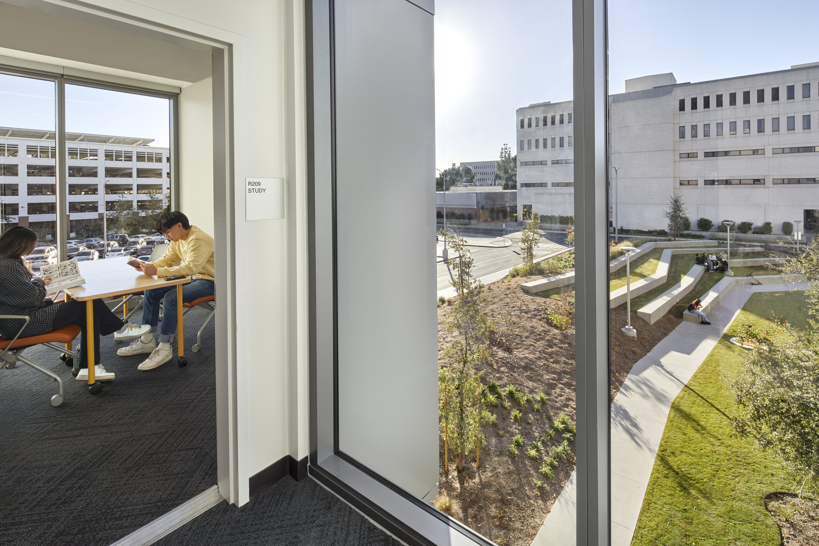
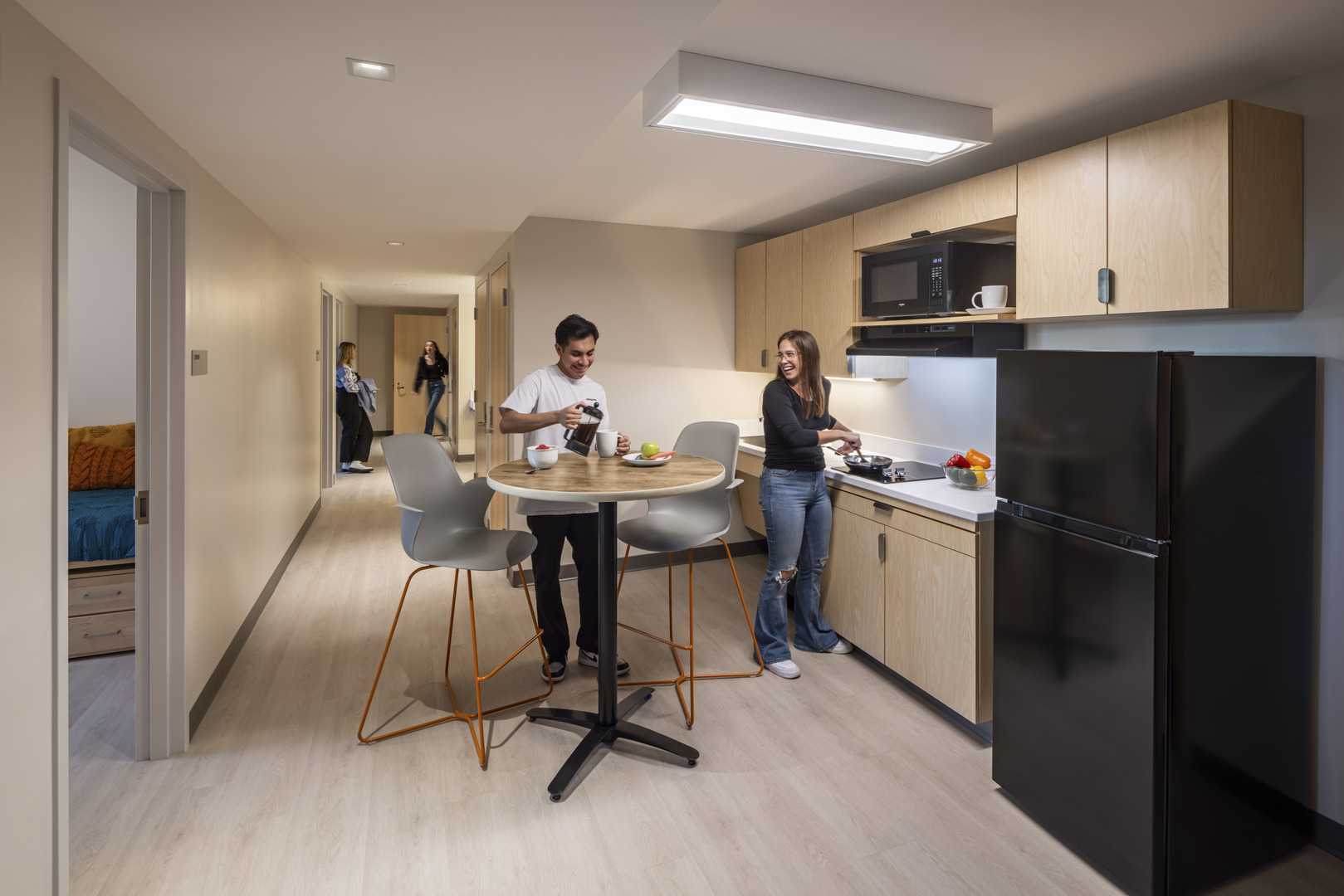
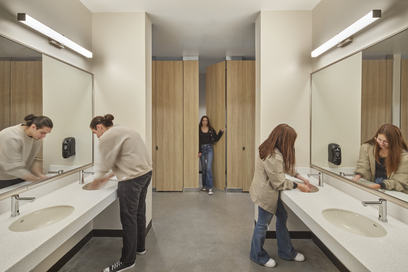
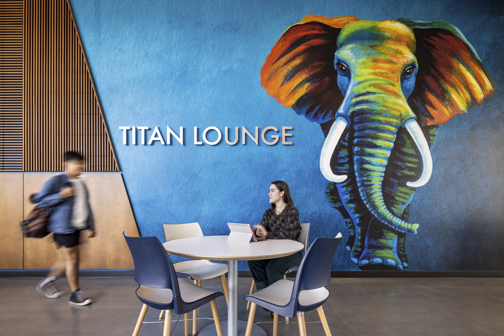
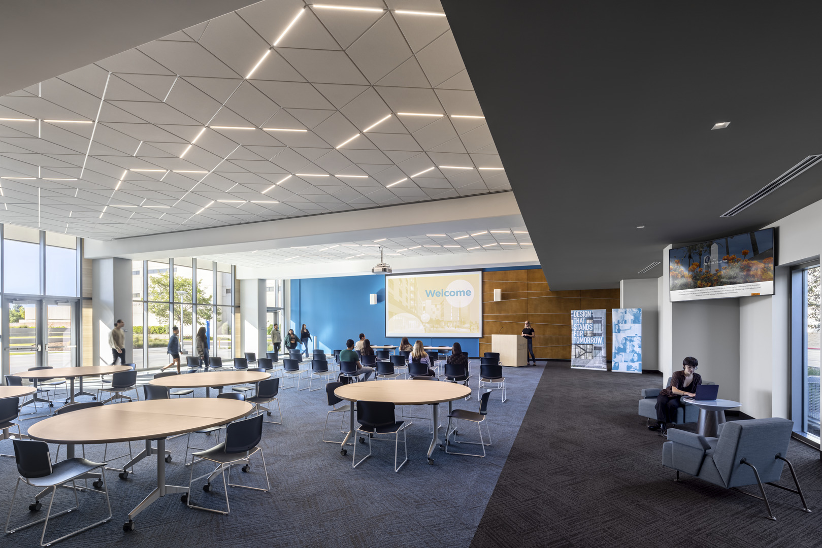
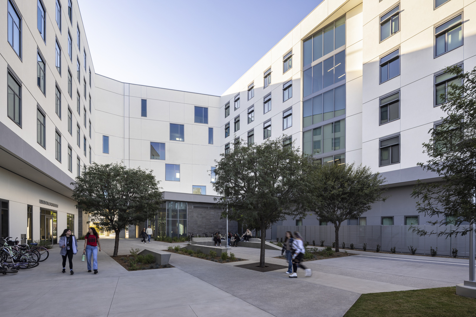
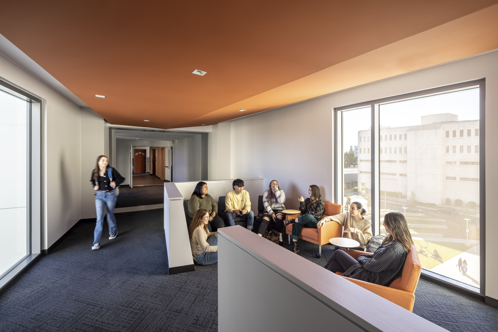
The design features distinct wings to give it a specialized identity and protect it against freeway noise on the east. While the complex is one building, the exterior massing reads as three separate units; from the exterior, one can easily point to their “house”. The building is identified by two northern wings and a single southern wing connected by a physical and social connecting bridge at each upper level. The bridge and common residential spaces overlook the ground-level sloped lawn with amphitheater seating to the west and an intimate courtyard for residents to the east. The design is driven by creating a new community at a variety of scales. Each four-bedroom suite has space for eight students, two bathrooms, and a small kitchenette. Every floor has space for socializing, studying, or relaxing. Shared amenities and social spaces — like the student lounge, laundry, mail room, administrative staff offices, and a 3,700 SF multipurpose room to host events— promote inclusivity and shared ownership. The communal student space, the iconic Titan lounge, is perfect for studying and socializing. Adjacent to the outdoor courtyard, the lounge connects students to the campus and welcomes them home. The building’s design incorporates the campus palette and an angular motif from hexagonal patterns found on the campus’ mid-century buildings to unite the interior and exterior architecture.
I love the privacy walls in the bedrooms. They help me to mediate conversations between roommates. Very innovative. Brianna Guzman, Resident Coordinator
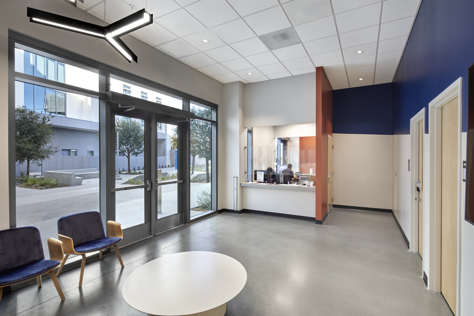
To ensure safety and connection to the rest of the housing community, the design includes three unique points of access on the ground floor. On upper levels two-five, each house has a set of doors separating itself from centralized shared amenity spaces. The elevators in two of the wings are also accessible from within the wing, allowing staff to adjust operations based on resident or conference needs, whether individually or as a cohesive unit.
Influenced by the master plan of the areas surrounding the new site, the project is situated between a parking structure, a loading dock, and a major freeway. The design-build team recognized the opportunity for this project to create a new neighborhood within the overall housing community and increase the total on-campus housing capacity to 2,200 students. The building meets their target LEED Silver Equivalent and improves on California’s T-24 energy performance requirements through an energy reduction of 15 percent. The expansion will play a prominent role in the image of the campus, from vantage points around campus as well as the surrounding community and adjacent freeway. At the same time, it will embody a character of human scale, and present itself as a social refuge and nexus for the hundreds of students who will call this building home.
This is the direction we want moving forward to create an amazing experience for our residents. Martin Quiroz, Resident Advisor
