By James Krueger, Design Principal, HMC Architects; Barbara Perez, Educational Facilities Planning Leader, HMC Architects
What is school branding and why is it important?
At the heart of school design is campus identity. Various levels of identity and branding can be applied to a school campus and they run the gamut from the development of logo, school colors, and mascot to a complete identity manual.
Branding and identity manuals are often used to guide and influence design of both new schools and renovations/modernizations of existing campuses. Branding can also be an effective way for a district to build identities for existing and new school campuses, create opportunities for academic improvement, and create a sense of pride for students, teachers, parents, and their communities.
Where do we start?
A school brand and identity is about defining who you are and clearly communicating that definition to your staff, students, and community. And it’s about creating excellence through the clarity of your mission and what you stand for. For these reasons, when undertaking a branding exercise or creating an identity package, it is important that stakeholders and user groups first define what a school’s program is about:
• Who are we?
• What do we stand for?
• What is our mission?
Ultimately, branding’s objective is to reinforce and remind the students and school community of their immediate and future goals.
Case Study 1: Small Learning Communities, Los Angeles Unified School District
Creating opportunities for academic improvement
In the framework of Small Learning Communities (SLCs), branding is an important concept that reinforces the academic programs at an intellectual, social, and cultural level, which in turn has a positive impact on a student’s loyalty, enthusiasm, and academic performance. Branding also creates cohesive and unique identities for a school’s SLC academic programs through a consistent narrative that guides the selection of branding design elements for each SLC.
The branding of Los Angeles Unified School District’s University High School’s SLC program was successful in many ways. It offered students the opportunity to improve academically by creating a focused learning environment and generating a sense of pride, loyalty, and ownership. The process also helped the students develop a positive image of their physical space and an emotional connection to the campus and academics.
Further, branding:
• Communicated Change to the Community. The students and the community saw and experienced change.
• Supported Marketing Opportunities. Visual Identity generated interest and awareness throughout the District and the community and attracted new students to the school.
• Expressed Campus Unity. The new graphic identity connected students to their school and campus.
• Students Got it! Students identify with many companies’ brands and symbols so it made sense to students that their school would also have a brand.
Case Study 2: Portola High School, Irvine Unified School District
Portola High School is Irvine Unified School District’s fifth high school that offers a fully-integrated curriculum. The program includes visual and performing arts as well as athletics. Early in the design process, the District selected a mascot—a bulldog—for the campus. HMC worked with school leadership and the community to further develop a unique and identifiable brand for the campus that included school color, font, and mascot. Once the branding was developed, it allowed the design team to reinforce the identity and implement the colors and branding elements contextually throughout the new campus.
At the beginning of the process, John Pherson, Portola High School’s Principal, believed that creating a unique identity for the campus was critical—particularly since it was a new school. The campus has only been open for a semester serving grade 9 but now, Pherson says, everyone in the community recognizes Portola’s “P” and its bulldog. Giving these students a unique identity and brand to build upon has helped foster a sense of community and pride within the campus in a very short time.
Connecting to community
An identity manual can be created as part of the design process to establish brand identity for a campus that serves as the primary visual, emotional, and cultural image for a school. An identity manual embodies a school’s vision, core values, and standards. It contains many components including, but not limited to, a logo, mascot, color(s), typography, stationery, and guidelines for implementation. When a campus/program is fully branded, it offers the community the opportunity to connect with the campus in a more direct way and provides an emotional connection that sets a school apart from other schools. A brand also allows the school leadership, staff, parents, and students to feel like they are part of something bigger—creating a sense of ownership and community for the campus.
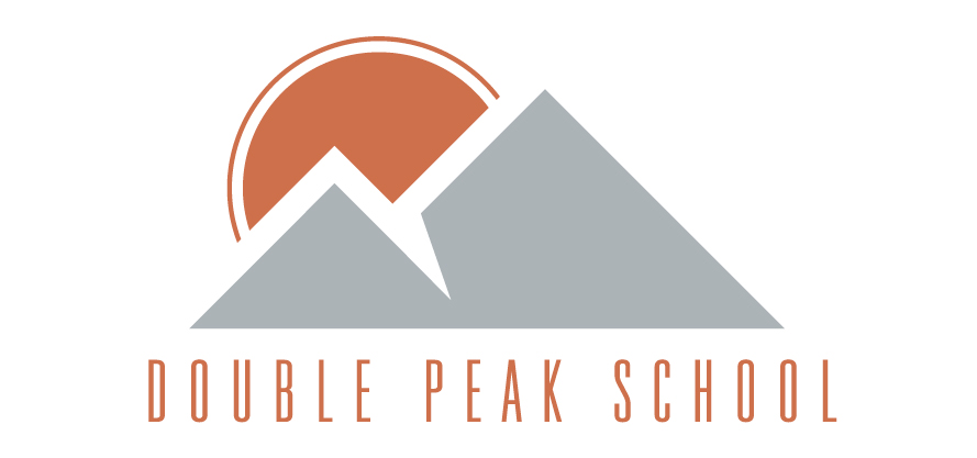
Case Study 3: Double Peak K-8 School, San Marcos Unified School District
The Double Peak K-8 School was designed and developed with the assistance of an identity manual. The District’s first step was to designate a branding team which consisted of the principal, PTO president and vice president, parent representative, and—because music is a focus of the school—the music director. This branding leadership team then worked closely with the HMC team, led by Senior Graphic Designer David Fennema, to develop the brand for the new K-8 campus.
Together, the District’s branding team and HMC’s design team identified the big ideas/goals for the school and explored how the logo and mascot could reinforce those goals. The school’s natural context and location within the Double Peak mountains and daily sun pattern were taken into consideration. Based on this inspiration and the school’s desire for an upscale feel, the HMC design team developed some contemporary mascots and branding ideas for the campus. Principal Steve Baum then took three potential mascots for the site to the local schools that feed into Double Peak for students’ reaction and vote. The “SUNS” was the clear winner.
The HMC design team then developed the “SUNS” mascot further, creating options for usage by sports teams and clubs. Streaks of orange were also integrated throughout the campus to reinforce the SUNS brand. The result is a final identity manual that covers many aspects of the brand: logo variations; usage guidelines and branding violations; fonts; pantone colors; and logo placement, margins, and use on letterhead. At the grand opening of the campus, Principal Baum spoke to the importance and value of the school’s mascot and what it means not only to the students and staff but also the Double Peak community. He added, “The branding process was an amazing experience. It created an unbelievable sense of school spirit, buy-in, and belonging. The branding manual has been invaluable to maintaining our true Double Peak School brand.”