When you construct a new building, your organization’s ethos should be seamlessly incorporated into its interior and exterior design—but how? Branding a building isn’t as simple as placing your logo on the walls and color coordinating your furnishings. You have to dig deeper to effectively communicate your organization’s philosophy and values.
Only through intentional, thoughtful design can you achieve a perfect representation of your brand in your architecture. By emphasizing authenticity and design cohesion, you can put your organization’s stamp on your new building and create a space that speaks to and resonates with visitors.
Here are the five main considerations to keep in mind when branding your next building project:
1. Avoid Design Gimmicks When Branding a Building
One of the biggest mistakes that organizations make when designing a new building is that they rely too heavily on their logo or mascot image to tie all of the spaces together. There are two major problems with this approach:
- It’s heavy-handed: Your logo doesn’t have to be the focal point of every single room or appear on every table. When you rely too heavily on an image, your branding will appear forced and may even negatively affect the visual impact. UCLA professor Alan Castel believes that people tend to ignore imagery they see frequently. In 2015, Castel researched this topic, asking a group of students to draw a very popular logo, one many of them see every day, from memory. The result? Fewer than half were able to do so. Castel claims this is because the more people see a logo, the less likely they are to actively pay attention to it. The logo loses its impact. Overt branding, therefore, could do the opposite of what you intend.
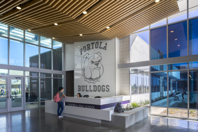
- It doesn’t serve a purpose: Placing your logo in every space won’t directly add to the comfort and experiences of your visitors. Every aspect of your building’s design must be intentional to be effective. For example, when Portola High School in Irvine, California, chose a bulldog as its mascot, our design team used the branding elements throughout the campus to not only establish the brand identity, but also to foster a sense of community and pride in students. The purposeful design caused students to feel true ownership of the campus.
- The best branding is subtle. So, by taking a step back and ensuring that every image serves a real purpose, you’ll create a more effective design—one that effectively expresses your brand.
Learn more about our school branding successes
2. Communicate Your Organization’s Philosophy
To communicate your organization’s ethos you must first ask emotion-laden and purpose-driven questions, including “How does my organization serve the community?” and “How do I want people to feel when they step inside my new building?” To answer these questions, use the consumer research you’ve compiled, and then consider the interior and exterior design elements that will speak to your customers and best support their needs.
For example, when Kaiser Permanente came to us to brand their pediatric patient experience across each facility, we designed solutions that not only effectively express the organization’s beliefs and values, but that also help patients and their families feel comfortable and welcome. Our interior design features include:
- Larger rooms that are more inviting and less intimidating to children.
- Child-friendly graphics that help with wayfinding and reduce patient anxiety.
- Images of local landscapes, including the ocean, mountains, and cityscapes, that serve to calm and educate.
Each design choice enhances patient experiences and speaks to Kaiser Permanente’s values. Although their logo doesn’t appear on every wall, patients still know that they are visiting a Kaiser Permanente facility because every pediatric clinic has consistent, recognizable design features. While the specific wall art differs from city to city, the feelings evoked by the artwork are the same across all locations. Kaiser Permanente created spaces that are familiar, that reduce the anxiety of visitors, and that positively impact the way their brand is perceived.
3. Create a Cohesive Space
The process of branding a building isn’t always prescriptive. However, a few basic interior and exterior design rules should be followed to maintain cohesiveness. This doesn’t mean you should paint every wall the same color or install the same lamps in every room. Cohesive design simply means designing in line with an overarching theme that holds all of the individual elements together.
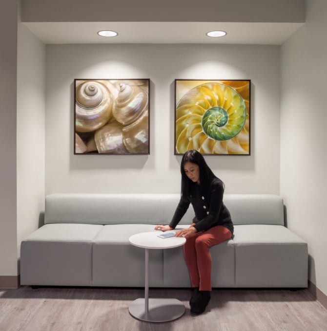
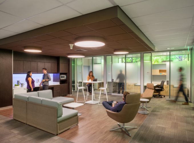
For example, in the Neurosurgery/Anesthesia Clinic at Kaiser Permanente’s Fontana Medical Center in California, every room looks different, but also stays true to its overall design. The expansive waiting area has light-colored wood flooring and includes a variety of comfortable sofas in soft, soothing shades of gray and light blue; the doctor collaboration zone feels slightly more private and features a richer color scheme; the smaller, more discreet patient waiting area has a subdued, grey color scheme and canvas prints of seashells on the wall.
All of these distinct spaces have a few design elements in common, including:
- A neutral color scheme on the flooring, walls, ceilings, and furnishings.
- Pops of color in the wall art and soft-blue under-cabinet lighting that add visual interest.
- Large, round ceiling fixtures that provide plenty of light and make the space feel relaxing.
Your exterior design should also be cohesive in expressing your brand message. Consider the following elements:
- Logo placement on the front of every building or even integrated into a sculpture at the front entrance.
Walkways and entrances that are welcoming and aid wayfinding—visitors should be able to easily navigate your building, even if they’ve never been there before. - Outdoor wall murals and sculptures created by local artists to show your brand’s commitment to the community.
- Xeriscape designs that require little to no irrigation and native plantings that express commitment to the environment.
4. Brand a Building With the Community in Mind
When you walk into a Starbucks, you know exactly what to expect—comfortable seating, soft lighting, free WiFi, and floor-to-ceiling windows. However, if you look closely at individual stores, you’ll see that they are utterly unique. That’s because Starbucks brands itself as a community coffee shop. The company purposefully injects local personality into its stores to make customers feel welcome and to cater to the specific needs of the community.
For retail chains like Starbucks, it’s important to design buildings that share some common elements yet maintain their own identities. After all, every community is different. For example, if your building primarily serves college students, then you might include eclectic artwork that appeals to them. Similarly, if you’re branding a building in a tech-centered city, you might consider interior design elements like digital interactive maps, custom charging hubs, and laptop workspaces.
Branding with the community in mind shows the people who use your building that you care about them and the neighborhood in which they live.
5. Partner With the Perfect Design Team
When branding a building, It’s important to partner with a design firm that understands your organization’s ethos and the specific needs and desires of the communities you serve. An experienced design team can help you create custom interiors and exteriors that are brand-identifiable, community-focused, aesthetically pleasing, and, of course, functional.
Your brand is the face of your organization and the expression of your core philosophy and values. Trust only the best to help brand your building through deliberate design.
To learn more about successfully branding a building, contact HMC Architects today. Our design experts are available to answer any questions you might have about ensuring that your brand is reflected properly and effectively in your interior design.


